“For those of us who are infinite in potential and unlimited in possibility.”
Today, 2/2/22, is a big day for us at iNSPiRETEK. Not only are we kicking off our Series A fundraise, but we are also unveiling our new brand. Our goal with this rebrand was much more than a facelift. We wanted to ensure that the iNSPiRETEK brand and suite of products best reflected the evolution our organisation and our aspirations to be a leading digital health company focused on young athletes.
The decision to rebrand was not made lightly or quickly, but it did come about organically as we began the next stage in our evolution into a global wellness brand. It was in the early days of planning that news broke about four-time Grand Slam Champion Naomi Osaka’s withdrawal from the French Open, followed by the most accomplished gymnast in US history, Simone Biles, choosing to withdraw from a number of events at the Tokyo Olympics. These two key events have served as catalysts for the mental health discussion in sports, leading to numerous athletes across all sports to come forward with their own mental health challenges. Sports were changing right before our eyes, so we figured that the time was right for us to do the same.
https://vimeo.com/https://vimeo.com/671800488
Inception.
For Annie, our CEO and Founder, who experienced her own mental health battles during her career as a competitive athlete, the word “inspire” has always resonated with her goals to help athletes the world over. The earliest versions of the brand were what you would expect from an early stage sports start up with limited time and resources, but both early iterations were effective in their purpose.
Involved.
Proudly, the entire creative process occurred in-house as the first major project of the newly formed in-house digital agency iNSPIRELAB, headed up by award-winning creative and Head of Digital, Brad Walker. Brad is no stranger to large scale rebrands, having worked in digital, creative, marketing and product for 20 years, his experience includes work in a variety of agencies and sports focused roles. The broader iNSPIRELAB team have all played important roles throughout the project, and alongside the brand working group, team work is what made this project possible.
Invent.
From the outset, the working group addressed different brand architectures that would best support the direction of iNSPiRETEK and the suite of current products, as well as leaving room for future growth. This was, in some ways, the most important step in the process, as it defined the entire brand structure now and into the future. iNSPiRETEK is laser-focused on specific areas of sports and young athletes but has its eye on other markets and driving positive change for all young people, all over the world, at it scales up.
A number of different directions were investigated, but ultimately we landed on a house of brands approach. As big fans of Australian-based Atlassian’s rebrand in 2017, it was clear a similar approach would allow us the room to grow our core brand and reinvent our product brands.
Inspired.
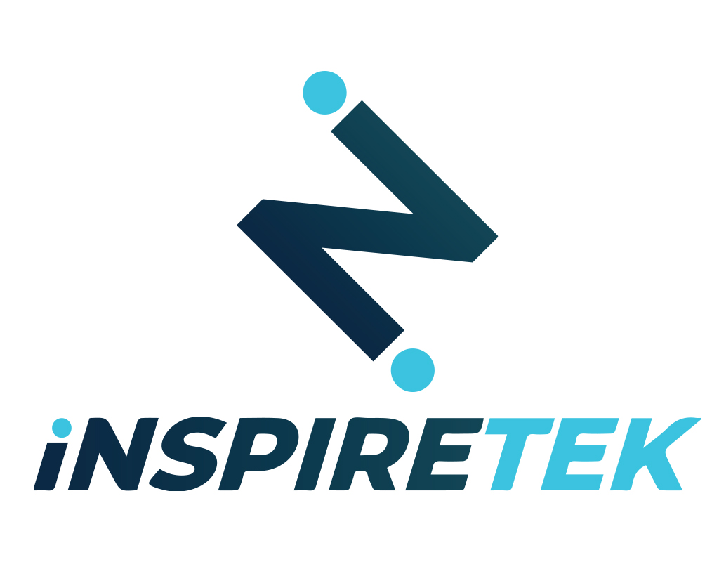
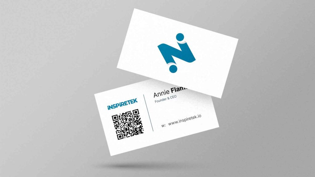
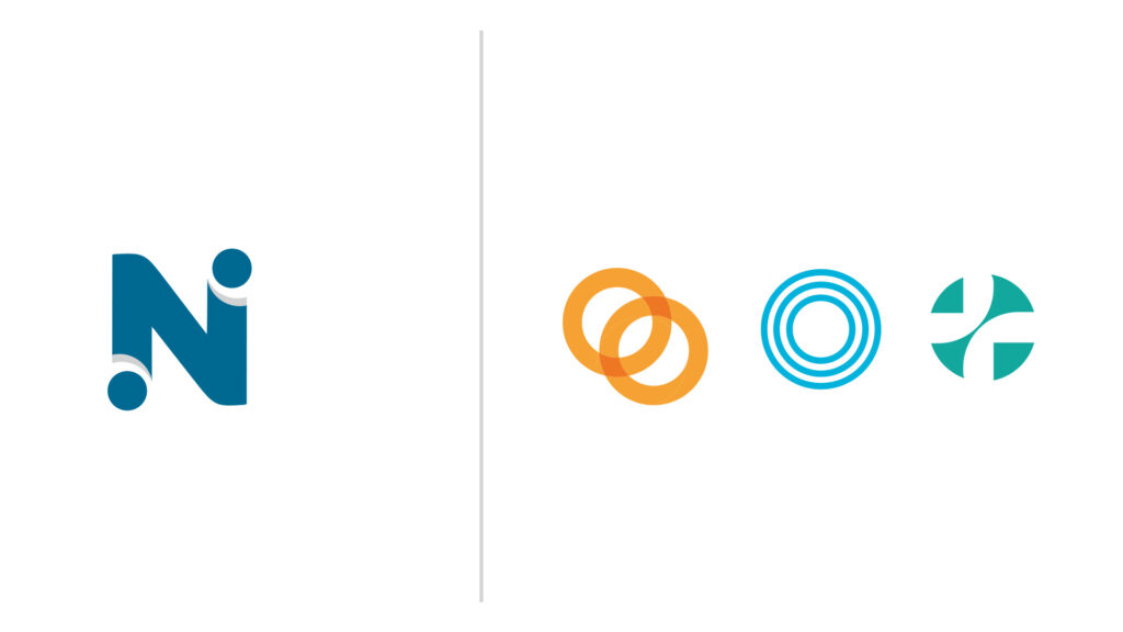
The direction of the new iNSPiRETEK logo was carefully approached. The core of the previous logo remains intact, but the styling has been refined and simplified to provide a more modern execution.
The most notable update is the refined integration between the brandmark and wordmark, which now match in style and forms a critical creative element across the entire brand family.

Striking a balance between corporate and consumer appeal is no easy task, but with the new brandmark as the canvas, that is our goal, especially as we look to emerge as a credible, respected leader for mental health, all over the world. Leaning into the concept of adaptability, a core value of our team, the brandmark provides a personality to our presence in the lives of young athletes and leading sporting organizations.
Invert.
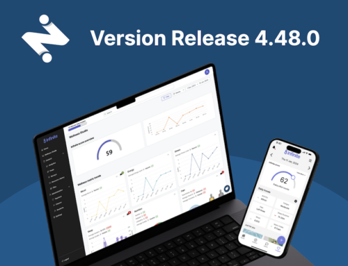
The first generation naming conventions of our product family were literal, such as iNSPIRETEK sport mobile.
While effective in the goal of defining the purpose within a name, these conventions created limitations as we started to scale in both size and objective. But to progress, we needed to consider the direction of our product roadmap and the technology behind our platforms. Instead of building out unique products for each new market segment, we chose to embrace our broad market fit by developing an entirely new naming convention which better supported our roadmap plans in specific sport verticals and beyond.
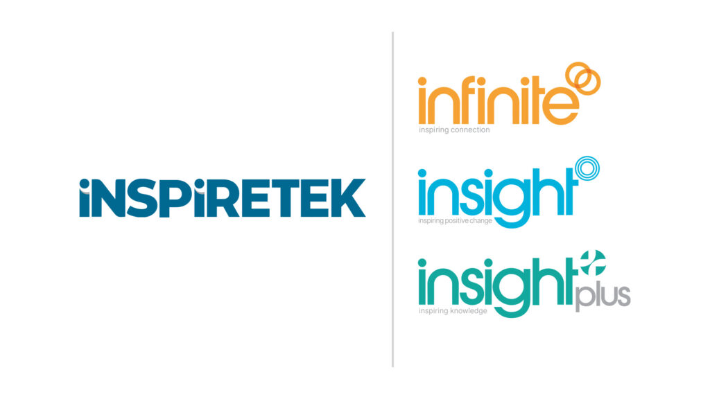
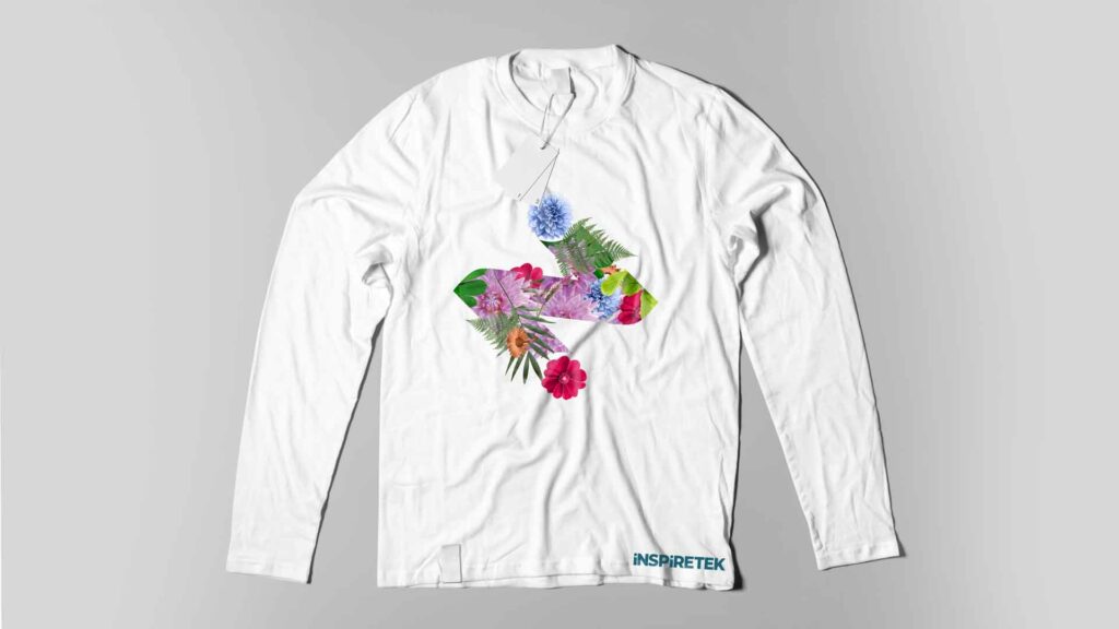
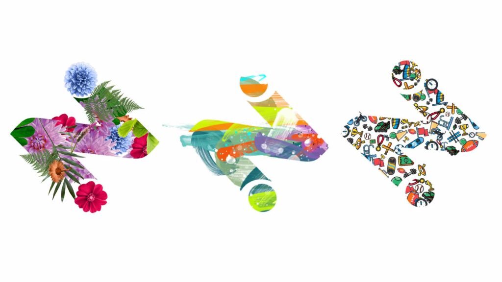
Built around consistency, each product name incorporates the ‘in’ within ‘inspire’ and features a name carefully selected to outline its purpose. The custom typeface and distinctive colour palettes compliment the brandmarks, which are all unique in execution but draw heavily from the circles found in the iNSPIRETEK brandmark. More than just arbitrary elements, the product brandmarks, which internally are referred to as rings, each reflect the connection and relationship between our users.
Intention.
As we continue expansion into new markets this year and beyond, we are truly excited about this next step in our branding and sharing the iNSPiRETEK mission with millions of young athletes, from Australia to the United States and all over the world. Marking the first of many major milestones set out for the year, our presence and purpose continues to grow alongside a problem that is more prevalent than ever, but is finally being discussed at all levels of sport.